Section 1 Part 2: Graphic Design and Posters
Activity 1: What do you know about posters?
Step 1: Download the ‘Key Features, Purpose, Audience’ worksheet.
Step 2: Answer the following questions and record your answers in the correct sections of the worksheet:

- What do posters look like? (Key Features)
- What are some of the common features? (Key Features)
- What should a poster do? (Purpose)
- Why might a company make a poster? (Purpose)
- Who might see a poster? (Audience)
- Are some posters made for specific audiences? (Audience)
Step 3: Next, list any posters that you have seen in the school grounds or on the way to school and/or look at the examples of school posters your teacher will show you.
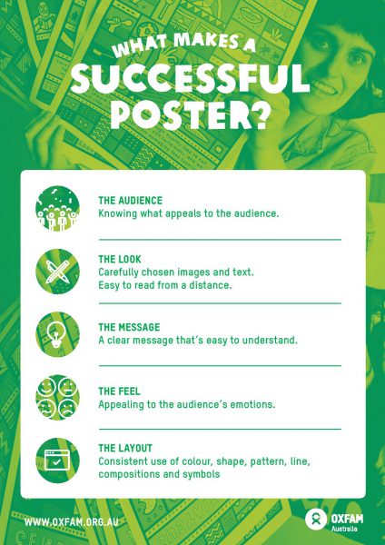
Step 4: In pairs, discuss the sample posters in terms of how they look (think about the images and text: is it easy to read, colourful, using shapes and lines etc.), what they do (is the message clear?) and also who their intended audience might be – who will see the poster (how does the poster try to get the audience’s attention? How does it appeal to the audience?). Check out the below infographic for more details on what makes a successful poster.
Activity 2: What is a graphic designer?
In pairs, discuss ‘What is a designer?’ Can you name any different kinds of designers?
A graphic designer creates the look of text and images on posters, in advertisements, magazines, books and on computer screens.
To do this a graphic designer uses colours, images, patterns and shapes to make the message clear and also more interesting to the viewer. A good graphic designer can take some plain printed text and change that so that the text and images, colour and pictures capture your attention and engage you.
Look at these examples of the ‘Right to be Heard’ goal as text, and then as a graphic designed poster. Which one do you prefer and why? Write your answers in your design diary.


Activity 3: Extension activity
Document four different kinds of graphic design posters in your art/design diary.
You could find an example of a poster created to advertise: a produce, a place, a social or political issue, an event (festival, concert, protest etc).
Annotate your examples with statements outlining the way that signs, symbols, conventions of poster design and elements of art are used. You can also comment on the purpose of the poster, identify the specific audience for the poster, and evaluate the overall effectiveness of the poster in communicating with the target audience.

